Design your showcase
The design tabs in the builder control how your proof looks. Every change shows in the preview straight away and saves on its own.
The tabs sit next to Proof at the top of the editing panel:
- Webpage: Brand, Content, Page, Cards
- Widget: Brand, Content, Cards (a widget has no page around it, so there is no Page tab)
The preview
The preview on the right is a live render of the real layout. Above it, the preview toolbar has:
- The panel button (Hide panel / Show panel) for a full-width preview.
- Layout: to switch layouts. See Create a showcase.
- Desktop and mobile buttons to change the preview size.
Check the mobile view before you publish. Layouts change column counts and text sizes on small screens, and a wall that reads well on desktop can become a long scroll on a phone.
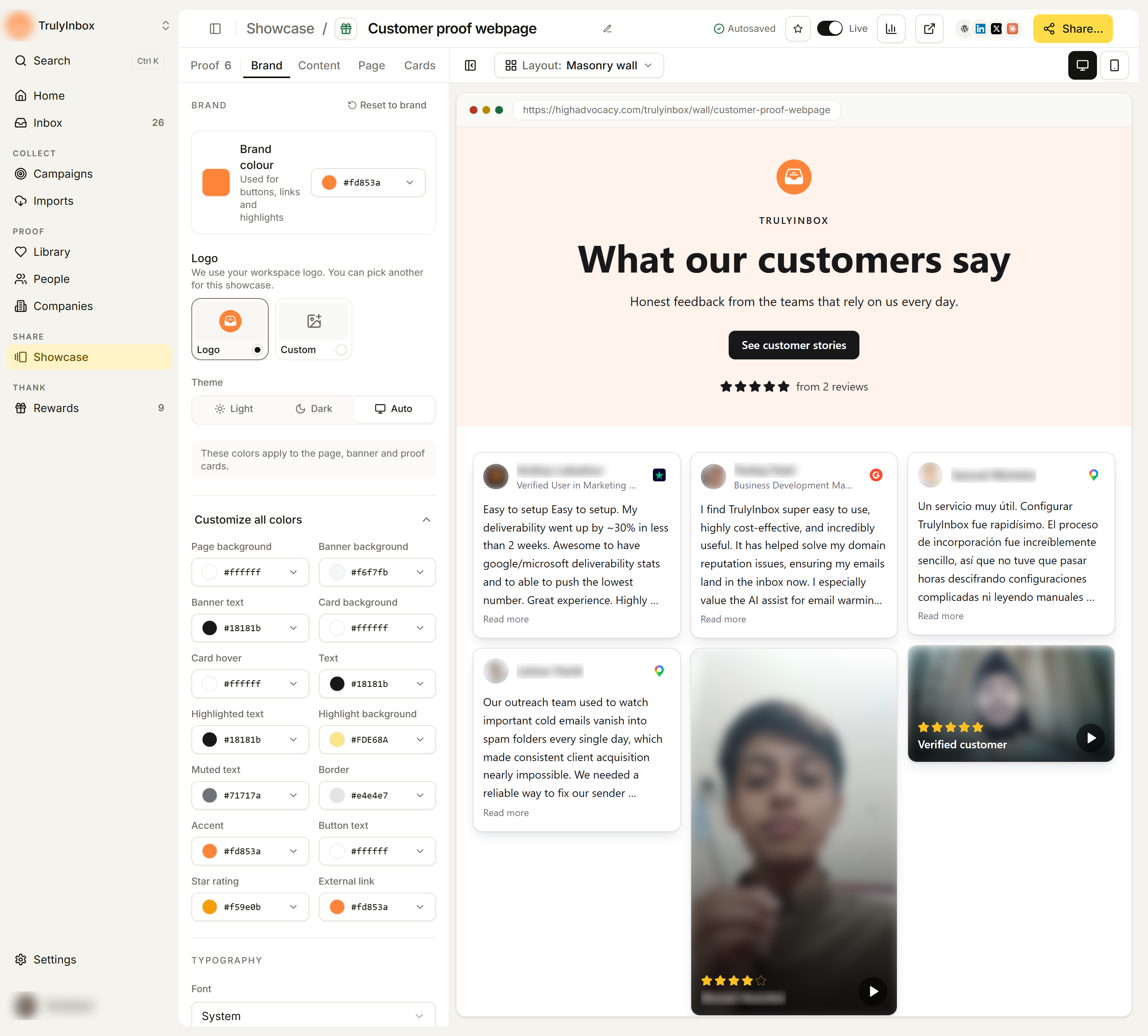
Brand tab
Colors, logo, theme, and font.
- Brand colour: “Used for buttons, links and highlights”. Pick a color or enter a hex value.
- Logo: “We use your workspace logo. You can pick another for this showcase.” Pick a tile or paste a logo URL.
- Theme: Light, Dark, or Auto.
- Customize all colors: opens every color on its own. A note explains where colors apply: on a webpage, “These colors apply to the page, banner and proof cards.”; on a widget, “The widget has no background, so it matches your site.”
- Both: Card background, Card hover, Text, Highlighted text, Highlight background, Muted text, Border, Accent, Button text, Star rating, External link.
- Webpages also get Page background, Banner background, and Banner text (set to Auto to pick a readable color for you).
- Font (under Typography): “Pick a Google font, or pick System to use the visitor’s own font.” For a widget, System usually blends in best with your site.
Reset to brand puts the colors and logo back to your workspace brand.
Content tab
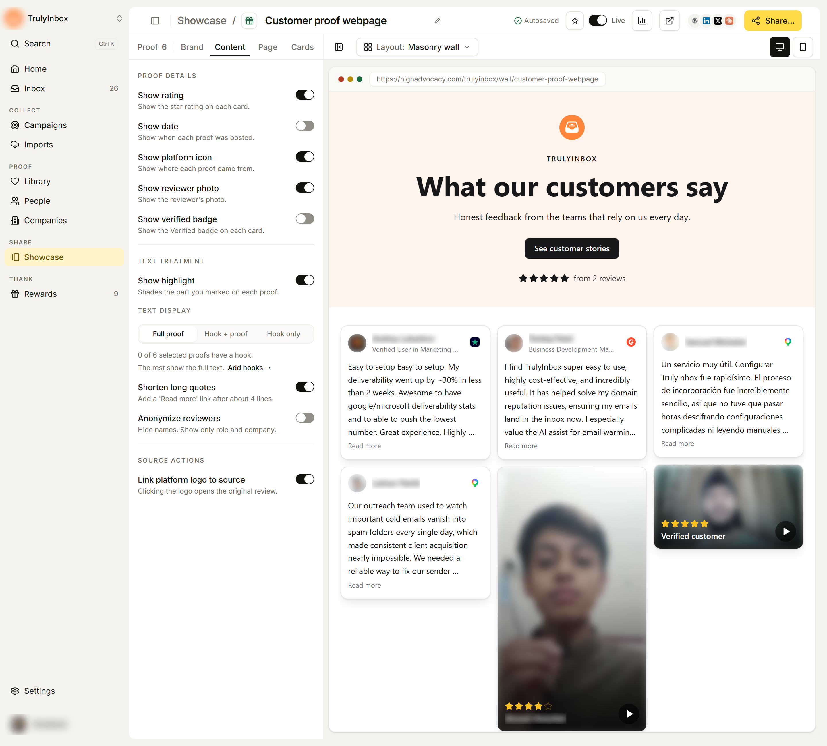
What each proof card shows, in three groups.
Proof details
| Setting | What it does |
|---|---|
| Show rating | Show the star rating on each card. |
| Show date | Show when each proof was posted. |
| Show platform icon | Show where each proof came from. |
| Show reviewer photo | Show the reviewer’s photo. |
| Show verified badge | Show the Verified badge on each card. |
Text treatment
| Setting | What it does |
|---|---|
| Show highlight | Shades the part you marked on each proof. |
| Text display | Full proof, Hook + proof, or Hook only. |
| Shorten long quotes | Add a “Read more” link after about 4 lines. |
| Anonymize reviewers | Hide names. Show only role and company. |
Source actions
| Setting | What it does |
|---|---|
| Link platform logo to source | Clicking the logo opens the original review. |
When Text display is set to Hook + proof or Hook only, the tab tells you how many of the selected proofs have a hook (“4 of 6 selected proofs have a hook. The rest show the full text.”). Click Add hooks → to jump to the Proof tab filtered to proof without a hook, then use Edit hook & highlight on each one. See Hooks and highlights.
Some layouts have fewer settings. Rating Badge shows only Show rating. Avatar Group, Avatar Blocks, and Company Logo Slider show “This widget type has no content settings.”
Show verified badge together with Link platform logo to source lets a visitor check a quote against the original review. Anonymize reviewers is for proof you can use but not attribute by name.
Page tab (webpages only)
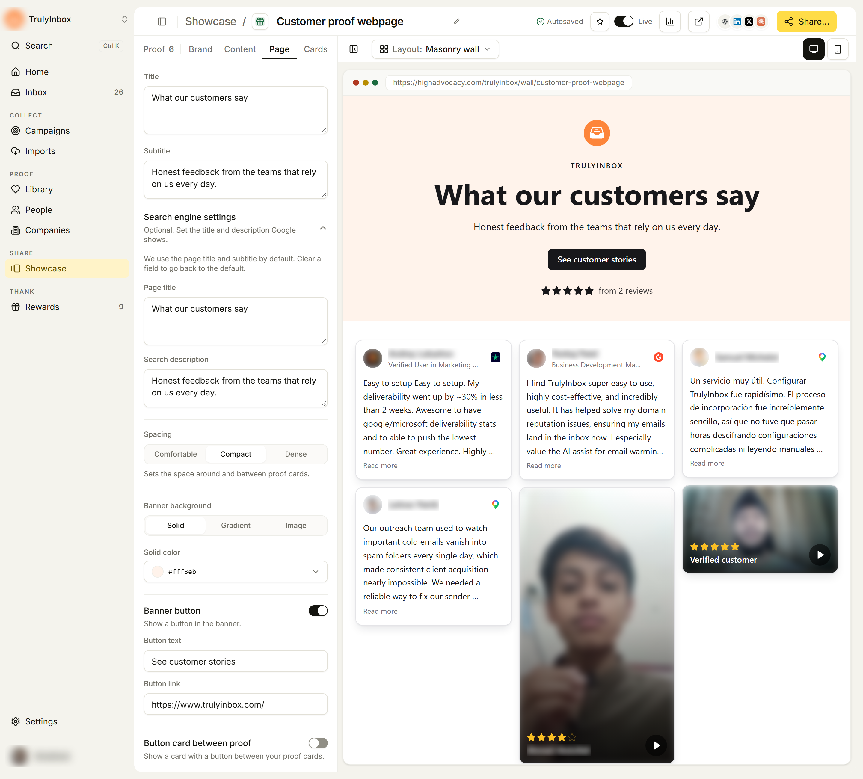
The banner at the top of the page and page-level settings.
- Title and Subtitle: the page heading and the line below it. Each layout starts with its own wording, such as “What our customers say”. Rewrite them for the audience you’ll send the link to.
- Search engine settings: “Optional. Set the title and description Google shows.” Set a Page title and Search description, or leave them empty to use the defaults.
- Spacing: Comfortable, Compact, or Dense. Sets the space around and between proof cards. Dense fits more proof on screen.
- Banner background: Solid (one color), Gradient (a start color and an end color), or Image (an image URL).
- Banner button: “Show a button in the banner.” Set the Button text and Button link.
- Button card between proof: “Show a card with a button between your proof cards.” Set its Title, Description, Card button text, and Card button link.
- Hide HighAdvocacy branding: hides the “Powered by HighAdvocacy” line at the bottom of the page.
Button links must be valid web addresses. If one isn’t, the top bar shows Fix the link to save and your other changes wait until it’s fixed.
Cards tab
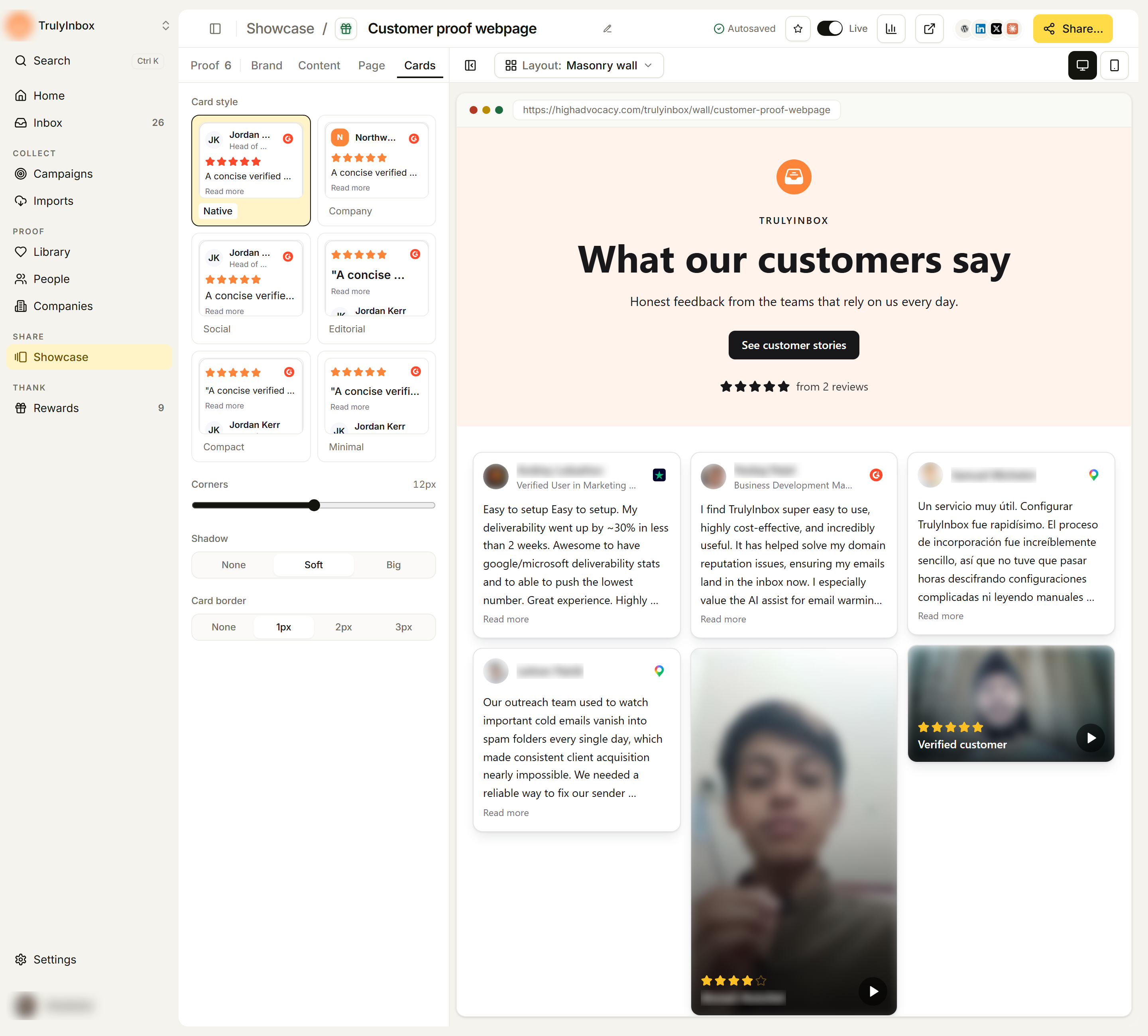
The shape and style of each proof card.
- Card style: pick from small previews. Depending on the layout, the options include Native (looks like the source platform), Company (leads with the company logo), Social, Editorial (the quote leads), Compact, Minimal, and Stat. Layouts with one fixed style don’t show this picker.
- Corners: a slider from square to rounded, with a pixel readout.
- Shadow: None, Soft, or Big.
- Card border: None, 1px, 2px, or 3px.
- Scroll speed: for the Vertical Scroll and Horizontal Scroll widgets, from 0.5× to 2×.
For a widget, match corners, shadow, and border to the page it sits on. A card with a heavy shadow on a flat site looks pasted in.
Saving
There is no save button. The top bar shows Saving… while changes are sent and Autosaved when they’re stored. If it shows Not saved, check your connection and make the change again.
If the showcase is live, visitors see your design changes as soon as they save.
Related
- Choose what proof appears: the Proof tab of the same builder
- Create a showcase: switch layouts without losing these settings
- Publish, share, and embed: put the finished showcase on your site